
Design Lead over 4 designers. Led component standardization, documentation, and cross-team adoption across 20+ product teams.
.jpg)
Overview
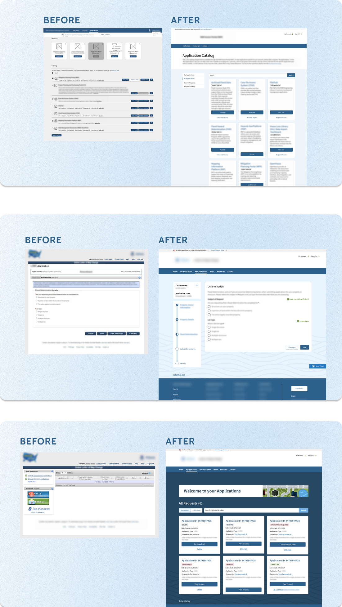
An agency maintained multiple digital platforms built independently over time. UI patterns were inconsistent, components were repeatedly rebuilt, and accessibility standards varied across products. I led the design system initiative to create a shared foundation for designers and developers, improving consistency, scalability, and cross-team alignment.
Challenge
We needed to introduce standardization without disrupting active development.
- Multiple teams designing in parallel without shared standards
- Core UI components rebuilt repeatedly across applications
- Accessibility compliance inconsistently applied
- Designers and engineers operating in silos
- Live products that could not be fully redesigned from scratch
Foundation & System Architecture
We began with USWDS as a baseline, but the agency’s workflows required deeper customization and structural alignment.
I led the development of a cohesive visual and interaction foundation that could scale across products while remaining flexible for application-specific needs.
This included defining:
- A unified color system aligned to accessibility standards
- A scalable typography hierarchy
- A spacing and layout framework to reduce visual inconsistency
- Core interaction principles to guide behavior across products
Rather than layering styles on top of existing interfaces, we established a durable system architecture that could support future growth.
Component System
I directed the standardization of high-impact, reusable components across applications, prioritizing patterns that were repeatedly rebuilt or inconsistently implemented.
Core components included:
- Buttons and states
- Form structures and validation patterns
- Navigation systems
- Modals and overlays
- Data tables and structured content patterns
Each component was fully documented with:
- Clear usage guidelines
- Accessibility requirements
- Defined edge cases
- Implementation considerations for engineering
Documentation was completed for every system component, creating a true single source of truth across teams rather than a static pattern library.
Governance & Cross-Team Adoption
Publishing components was not enough. Sustaining consistency required governance.
I established contribution and review workflows to manage how new components or variations entered the system. Teams were encouraged to evaluate reuse before introducing net-new patterns, reducing duplication and drift.
As Design Lead, I:
- Mentored and reviewed work from 4 designers contributing to the system
- Facilitated cross-team design discussions to align on interaction standards
- Partnered directly with engineering leads to ensure accurate implementation
- Resolved conflicts between product needs and system integrity
The system evolved into an actively maintained framework, supported by an internal documentation site and structured contribution guidelines.
This shifted the organization from fragmented design execution to a shared, scalable design language.
Outcome
The design system shifted the agency from fragmented product teams to a shared, scalable design foundation.
As a result:
- Reduced redundant component builds across multiple product teams
- Increased visual and interaction consistency across 6+ major applications
- Improved onboarding for new designers through structured documentation and defined standards
- Strengthened accessibility alignment by embedding requirements directly into component usage
- Enabled faster feature delivery through reusable, production-ready components
- Established a sustainable governance model to support long-term system evolution
What began as a standardization effort became an operational shift toward shared ownership, consistency, and scalable design practices across the organization.
